Decarbonization AI AgentTurn your net-zero target into a plan you can act on
Build a decarbonization pathway from your own emissions and see which projects close the gap, and what they cost.
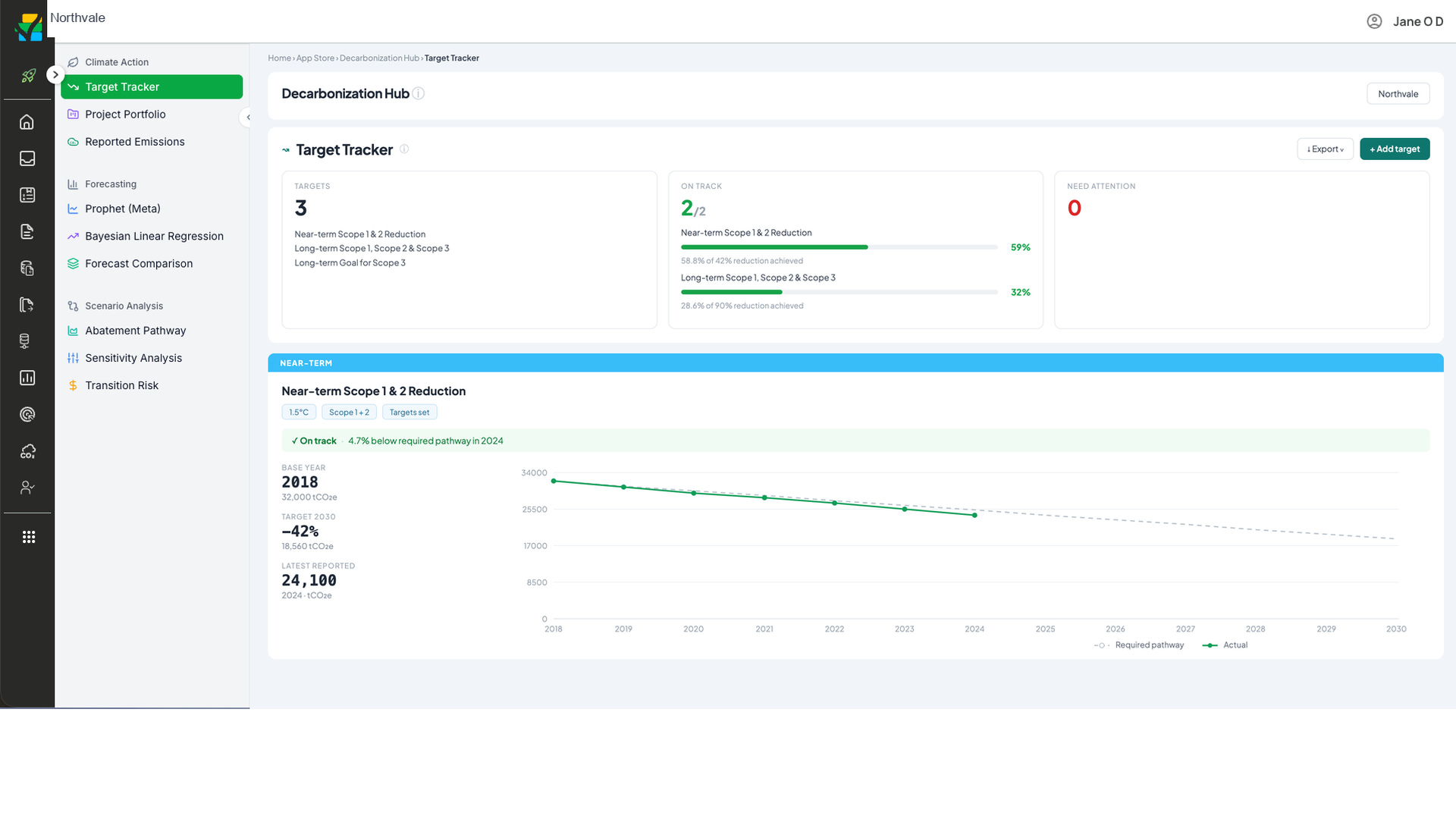
You can see whether you are ahead of a target or behind it, year by year
A target is defined by its horizon, the scopes it covers, the base year and the percentage cut. Pulsora draws the pathway those inputs require. Each year of reported emissions is then plotted against that pathway.
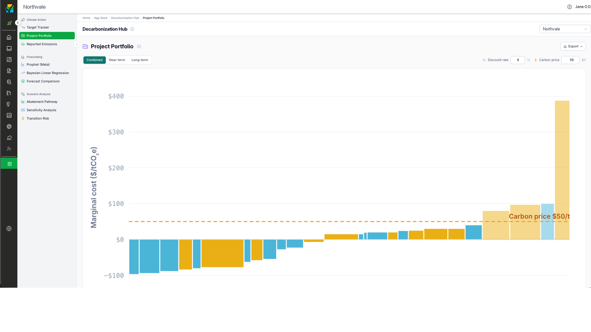
Every abatement project ranked by what a ton actually costs
Projects sort cheapest to most expensive. Bar width shows how much each project abates. Bar height shows its cost per ton. Anything below your carbon price line returns more than it costs at that price.
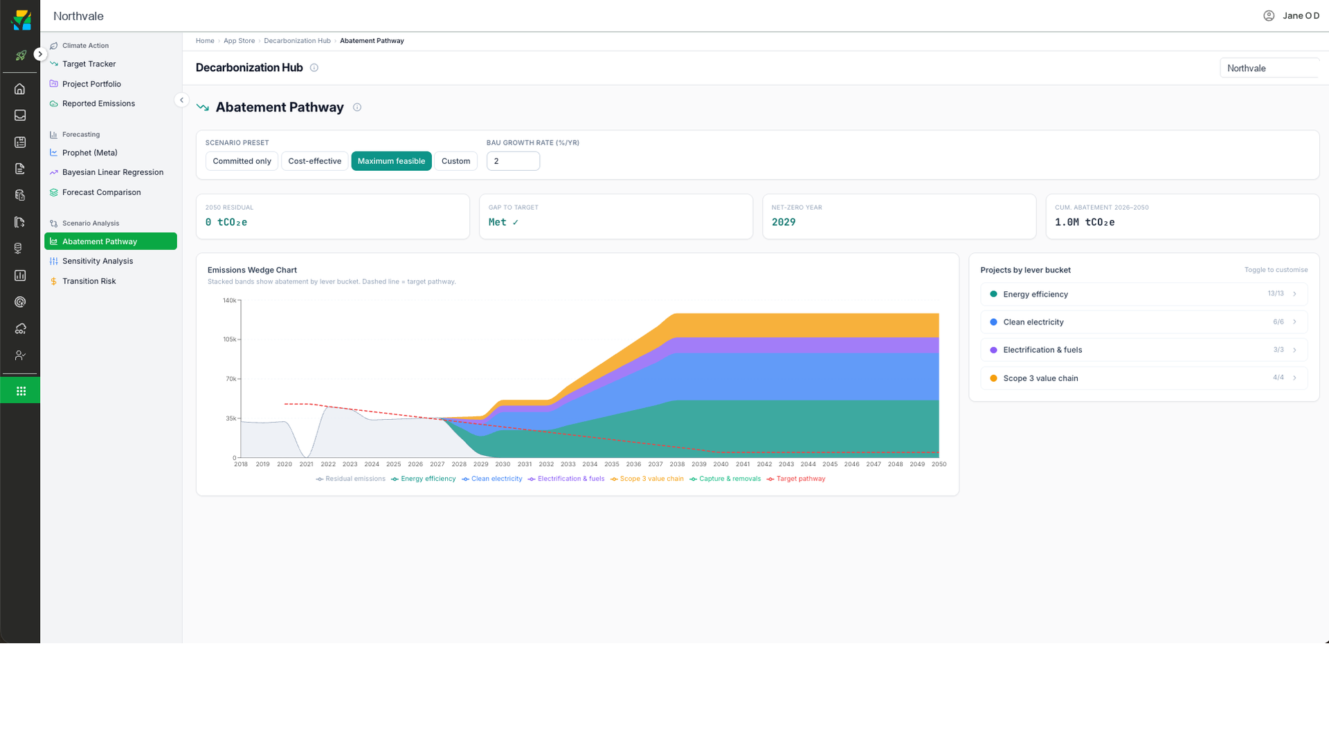
Pathways built on your real emissions
Decarbonization builds every pathway on your actual emissions data in Pulsora, so the routes reflect where you really are, not a generic baseline.
From baseline to net zero
Project your trajectory under committed, cost-effective, or maximum-feasible scenarios.
Act on the biggest levers
A stacked abatement chart shows each lever's contribution, from efficiency and clean power to electrification, value chain, and removals.
See the gap close
Track gap-to-target, net-zero year, and the project count behind each lever.
Decarbonization FAQ
Emissions pathways to net zero, built on your actual emissions data.
Yes. Each option lines up with SBTi and the regulatory targets you report against.
Every pathway shows its cost, timeline, and impact, so you can weigh them side by side.
Yes. You can try Pulsora AI free for 14 days.


